My role: Front-end coding of multiple iterations of responsive prototype layout and all responsive UI, UX pattern instances and components for Adobe Support article redesign (3.0), using HTML, Sass/CSS, jQuery, JavaScript.
Interaction development for multi-device and multiple viewports, with considerations of mobile, touch and accessibility.
Interaction development for multi-device and multiple viewports, with considerations of mobile, touch and accessibility.
Changes to prototype in rapid iterations based on usability testings. The final version of the prototype was used as a hand-off/demo of functionality and responsive behavior (with specs) to build CMS template of the same, by collaborating teams.
Some of the representative layout patterns in multiple viewports are included here in low-res to be able to discern the variations in patterns, not for reading text.
The responsive components have multiple design breakpoints and not just three device specific breakpoints which make them look and work well in a range of viewports and devices, not just three device specific viewports.
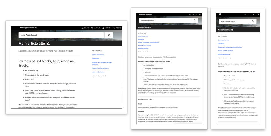
Overall layout in small, large, medium and small screens
Layout with 'sticky' top bar with header and search icon to get to search quickly
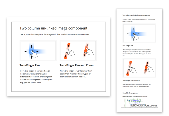
Responsive behavior of two column image and descriptive text
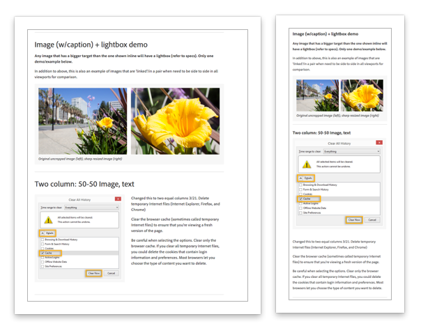
Responsive behaviors of an image with caption and lightbox and a image and text columns
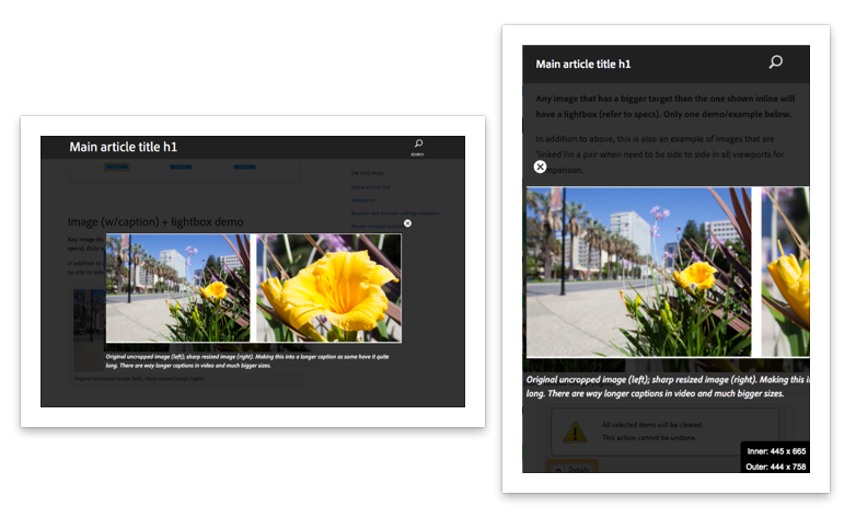
Responsive lightbox with specific sizes in desktop and smaller viewports to be able to discern image details even in small viewports. Optimized for both click and touch behaviors in multiple viewports. Tested to find issues and work on real devices.
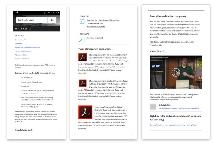
A few image and video components in medium viewports
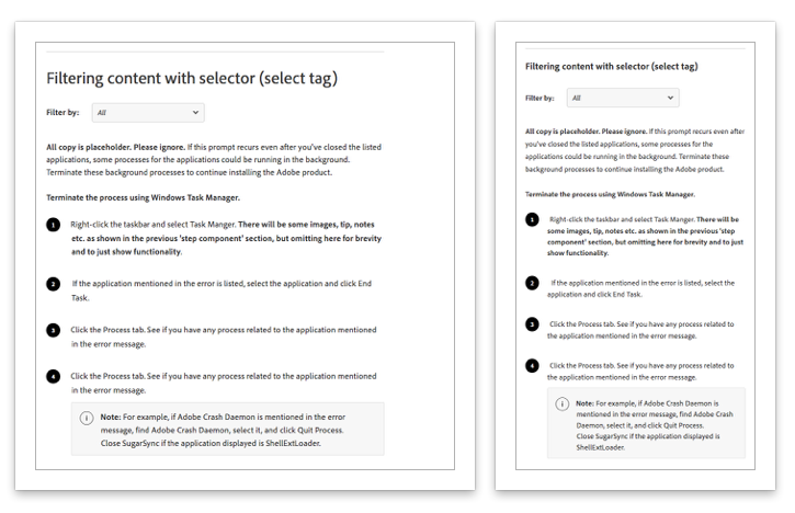
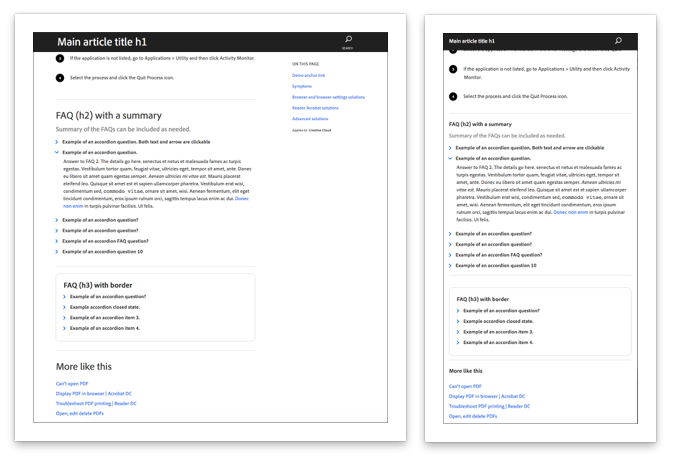
Quick filtering of content pertaining to specific conditions and OS
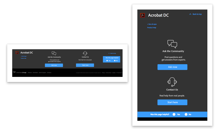
Responsive variations of footer component