I recently came across an article by Zurb that said "Over 40% of emails are opened on a mobile device".
This made me think it is time to extend our love of mobile optimization to HTML newsletters as well.
This made me think it is time to extend our love of mobile optimization to HTML newsletters as well.
Here's the result!
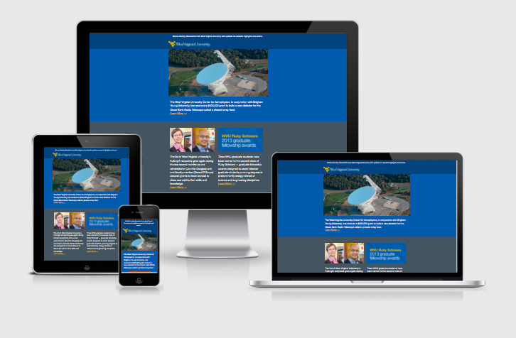
Mobile and multi-device friendly responsive redesign of an HTML enewsletter for WVU Research.
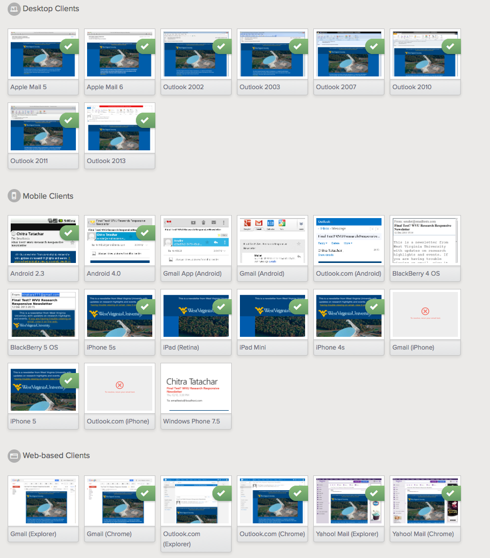
The second image shows litmus test results of the email on various email web and mobile email clients.
My Role: Concept to completion. UX, Design, Coding of the responsive newsletter, updating content created by various WVU writers and editors and bi-monthly email blast to list-servs.
Let me know if you like this by giving me a thumbs up below :)
Let me know if you like this by giving me a thumbs up below :)
LItmus test results of the email.