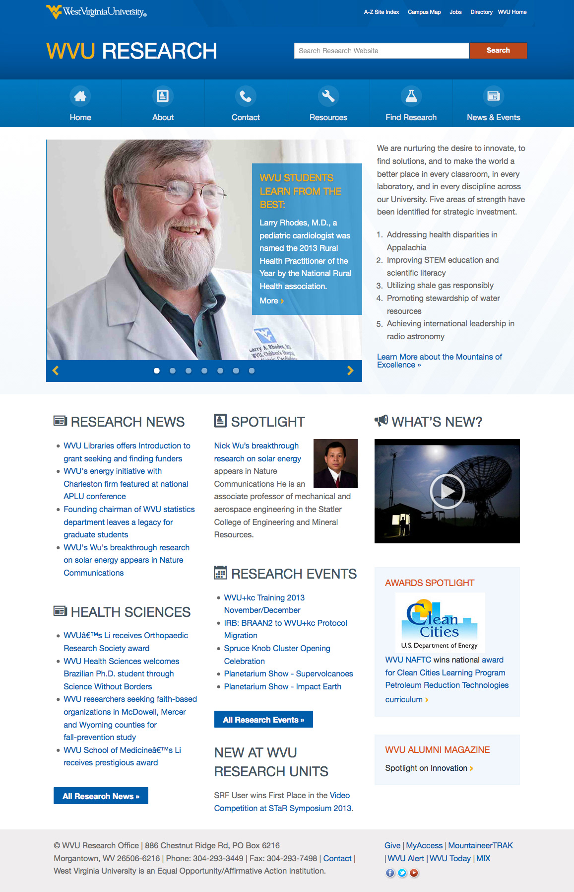
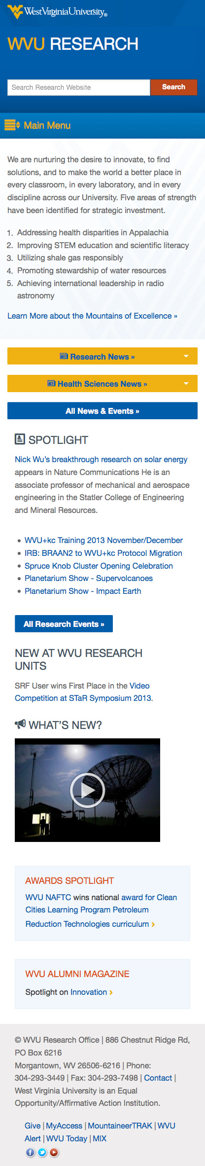
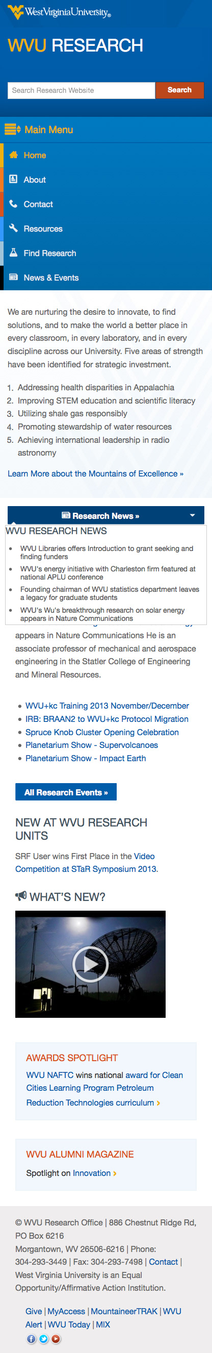
These are screenshots from my responsive redesign of WVU Research Portal website. A website used by WVU researchers, faculty, employees, public policy makers and general public interested in learning about WVU Research. Designed and coded by yours truly.
*WVU Research website has been redesigned since this writing and current website does not reflect my iteration described below.
Languages, Technologies used: HTML, CSS, Javascript, JQuery, Content Management System (WVU Slate based on Ruby on Rails). I used a mobile-first, completely responsive framework, Foundation 4 (Sass version); Icomoon icon fonts, svg graphics, CSS sprites, Data URIs (limited). For more details on design, rationale, technical specs, and the progression of the project see details below.
This was tested OK using Live testing on many brosers, and on numerous mobile OSs, Firefox, Safari, Chrome, IE 11, IE 10, IE 9 and Yes even IE 8! And on numerous old and new mobile devices as well.
Technical Details:
Here's is my blog post on WVU Research redesign with technical details on workflow, performance optmizations and more.
Technical Details:
Here's is my blog post on WVU Research redesign with technical details on workflow, performance optmizations and more.
Website Link:
*Please note the website has been redesigned since this writing and does not reflect my iteration described here.
research.wvu.edu
My Role:
Research of other universities' research and research office websites, concept, design, information architecture, front-end development, posting and maintenance of content and graphics into content management system.