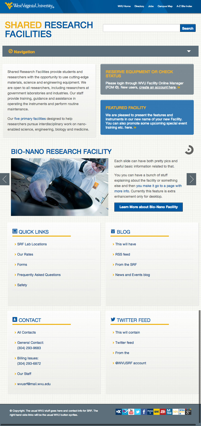
This is a website used by WVU and external faculty, researchers and students to find and use the various cutting-edge materials, science and engineering equipment. It includes training, guidance and assistance by the SRF staff in operating the instruments and perform routine maintenance.
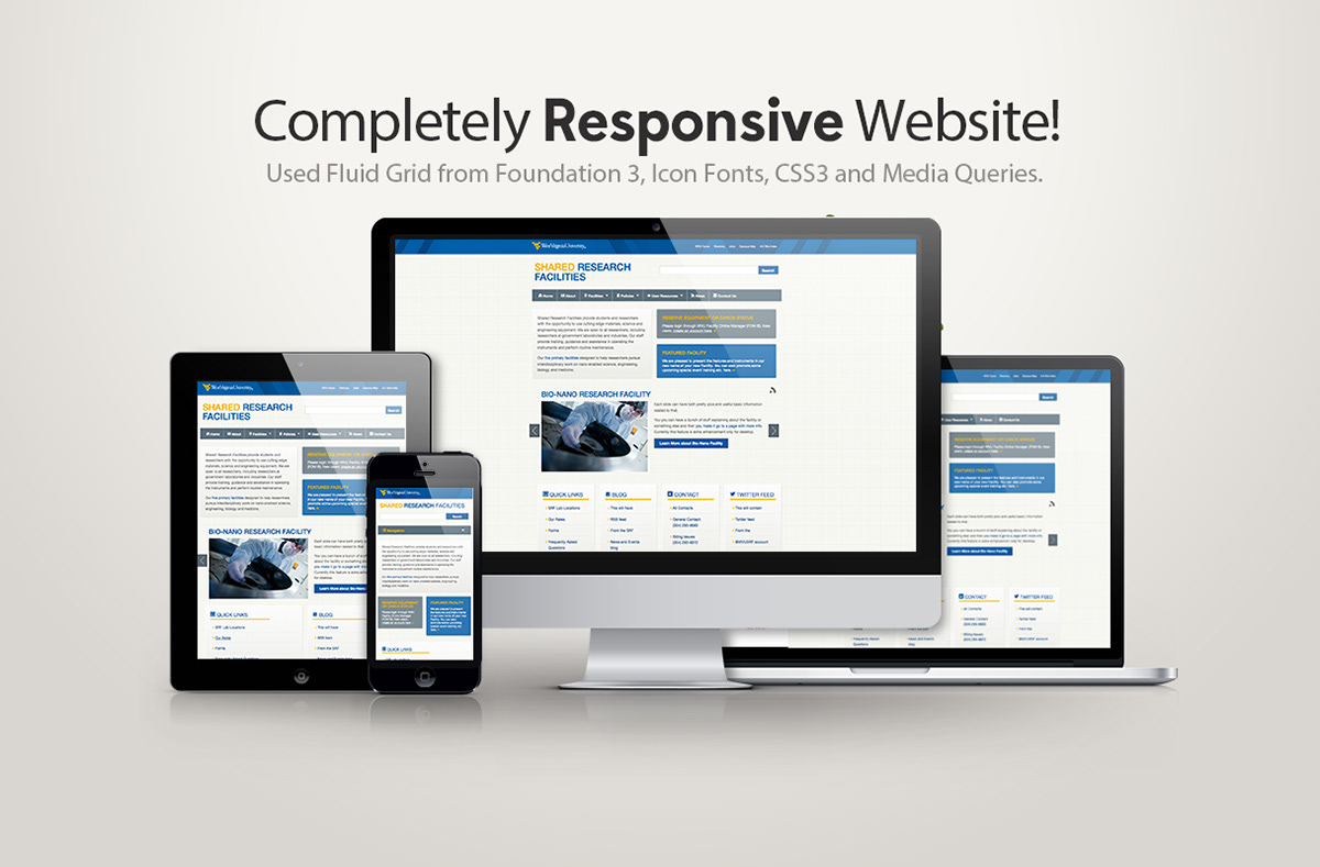
A completely responsive and device-agnostic layout with media queries and fluid grid based on design breakpoints so it conforms to any of the 100s of devices/viewports in the market.
Website Link:
After creating initial sketches and wireframes and getting client input, I skipped the photoshop mockup process and just designed in the browser. I started from Foundation 3 Responsive Grid (by Zurb), customizing and adding CSS3 styles, used icon fonts, JQuery elements, WVU branding elements, colors, some polyfills etc.; continued with browser testing (tested even on IE10 and IE10 metro via browserstack) and work arounds to make things work well on all browsers. Works great up to IE 8.
My role:
Redoing pre-existing information architecture and modifying the user experience based on client and user feedback; UI design; coding and majority of content posting on our WVU Slate (CMS based on Ruby on Rails).
Redoing pre-existing information architecture and modifying the user experience based on client and user feedback; UI design; coding and majority of content posting on our WVU Slate (CMS based on Ruby on Rails).
Performance:
I have basic performance optimizations in place (minifying CSS, JS, reducing http requests, compressing images etc.) based on web performance tests.
As of this writing:
Webpage test stats to be about: 489K (1.7-2.6 secs) for Home page!!
Mobitest stats show download time for home to be about 3.3 secs, and a sample back page is about 2.8 secs (233K).
Obviously, it is on the lower end of the responsive site size spectrum, as I have tried to keep the overall size of the site small, whether desktop or mobile. reducing the size and number of images and the overall size of the website by using CSS3, reducing HTTP requests and more.
Thanks for comments, appreciations if any ;-)

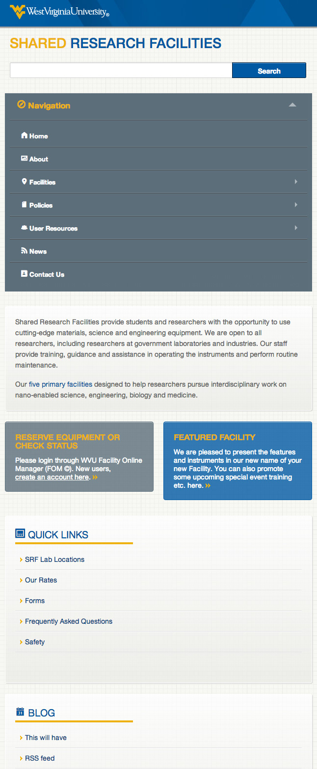
Navigation Expanded.